


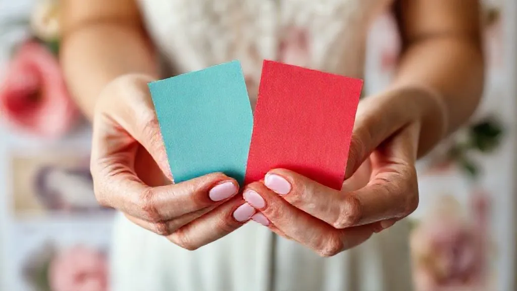
How to Subtly Pivot a Client from Clashing Wedding Colors?
For over two decades in the vibrant, often challenging, world of wedding decor, I've encountered countless scenarios where a client's vision, while heartfelt, veers sharply into a territory of clashing colors. It’s a delicate dance between honoring their dream and ensuring a truly beautiful, cohesive aesthetic.
This isn't about telling a client 'no' directly; it’s about understanding their underlying desires and gently steering them towards a more harmonious, sophisticated outcome. The challenge lies in doing this without causing offense or making them feel unheard, which can severely damage the client relationship.
In this definitive guide, I will share my tried-and-true frameworks, empathetic communication strategies, and visual tools that empower you to subtly pivot a client from clashing wedding colors. You’ll gain actionable insights and expert techniques to transform potential design disasters into breathtaking celebrations of color and style.
Understanding the Client's True Vision: Beyond the Surface Color
Before you can even think about pivoting, you must deeply understand what your client is truly trying to achieve with their initial color choices. Often, clashing colors are merely a symptom of an underlying desire for a certain mood, feeling, or cultural significance that hasn't been fully articulated.
I always start by asking open-ended questions. Instead of focusing on the colors themselves, I inquire about the emotions they want to evoke, the atmosphere they envision, or any personal stories tied to their initial selections. This approach helps uncover the 'why' behind their choices.
For instance, a client might insist on bright orange and neon green, not because they love those specific hues together, but because they want a 'fun, energetic, and unique' celebration. This insight is your golden key to offering alternatives that fulfill the same emotional brief but with greater aesthetic harmony.
"True design mastery isn't about imposing your will, but about translating a client's raw desire into refined beauty."
The Art of Gentle Inquiry: Uncovering the 'Why' Behind Their Choices
The conversation around color should always begin with curiosity, not correction. I've found that clients often have a deep-seated reason for their color preferences, whether it's a favorite childhood memory, a cultural tradition, or simply an attempt to be 'different'.
My strategy involves asking questions like: 'What feeling does this color palette evoke for you?' or 'Is there a particular memory or inspiration behind these choices?' This opens a dialogue where they feel heard and valued, rather than judged. It also gives you invaluable context.
Listen intently to their responses. Are they seeking vibrancy? Sophistication? Playfulness? Once you identify the core emotional driver, you can then propose alternative color combinations that achieve that same feeling but with a more refined touch. This empathetic approach builds trust and rapport.

Introducing the 'Color Story' Concept: A Unified Narrative
One of my most effective tools is shifting the client's focus from individual colors to a holistic 'color story'. This concept helps them understand that wedding colors aren't just about two or three hues, but about creating a cohesive visual narrative that flows through every element of their day.
I explain that a strong color story uses a primary color, secondary supporting colors, and subtle accents, all working together to tell a visual tale. This framework naturally guides them away from jarring combinations by emphasizing balance and progression rather than stark contrasts.
Presenting color as a 'story' makes it more engaging and less about right or wrong. It encourages them to think about how each color contributes to the overall narrative, making them more open to adjustments that enhance the plot, so to speak. This is where you begin to subtly introduce harmony.
Case Study: From Neon Nightmare to Elegant Emerald
I once had a client, Sarah, who was absolutely set on a shocking pink and electric blue combination for her garden wedding. Her rationale was 'fun and bold.' Instead of directly challenging her, I introduced the concept of a 'vibrant garden story.'
I asked her to imagine the journey her guests would take, from invitations to reception. We discussed how certain colors might feel jarring in natural light. I then proposed that we capture the 'fun and bold' spirit by anchoring her palette with a rich emerald green, hinting at the garden, and introducing shades of fuchsia and sapphire as vibrant accents, rather than primary, clashing elements.
We kept touches of the bright pink in smaller details like floral stamens and cocktail napkins, but the overall 'story' became sophisticated and deeply vibrant. Sarah loved it, realizing the elegance achieved while still retaining her desired energy. This resulted in a stunning visual experience that exceeded her initial vision, and a very happy client who felt her initial idea was respected and elevated.
Visual Storytelling: Mood Boards & Digital Mock-ups as Persuasion Tools
Humans are inherently visual creatures, and nowhere is this more true than in wedding design. Abstract discussions about color theory often fall flat. This is why visual tools are indispensable when you need to subtly pivot a client from clashing wedding colors.
I always create two distinct mood boards. The first might gently incorporate elements of their original, potentially clashing, idea but subtly soften them. The second board presents a refined, harmonious alternative that achieves the same emotional impact they initially sought.
Digital mock-ups of their venue with different color schemes are also incredibly powerful. Seeing their chosen colors applied to actual tablescapes, lighting, and floral arrangements helps clients visualize the real-world impact. This often provides the 'aha!' moment far more effectively than any verbal explanation.

The 'One Step Removed' Strategy: Suggesting Complementary Tones
When a client is fixated on specific colors that simply don't work well together, my 'one step removed' strategy comes into play. Instead of rejecting their colors outright, I propose alternatives that are closely related but possess different undertones or saturation levels, making them more compatible.
For example, if a client loves a harsh lime green and a vivid purple, I might suggest moving to an olive green or sage, paired with a deep plum or lavender. These are 'one step removed' from their original choices but offer a much softer, more sophisticated harmony while retaining the essence of their preferred hues.
This technique acknowledges their preference while subtly guiding them towards a more refined palette. It's about finding the sophisticated cousin of their chosen color, rather than an entirely new family. According to color theory principles, subtle shifts in saturation and tone can dramatically alter the perception of harmony, as detailed by experts like Pantone in their seasonal color trend reports. Learn more about color trends from Pantone.
Leveraging Color Psychology & Current Trends for Persuasion
Introducing the power of color psychology can be a game-changer. I educate clients on how different colors evoke specific emotions and how a cohesive palette contributes to the overall guest experience. This appeals to their desire for a memorable and impactful event.
For instance, I might explain that while bright yellow is cheerful, too much can feel overwhelming, whereas a softer buttercup or mustard can convey warmth without visual assault. I also subtly introduce current wedding color trends, not as dictates, but as inspirations that demonstrate how sophisticated palettes are being used today.
Presenting examples from high-end wedding magazines or blogs can illustrate how a refined palette elevates the entire event. This approach frames the pivot as an upgrade to a more current and sophisticated aesthetic, rather than a correction of a mistake.
Color Psychology & Aesthetic Impact
| Color | Common Associations | Potential Pitfall (Clash) | Subtle Pivot Example |
|---|---|---|---|
| Red | Passion, Love, Energy | Aggressive, Overpowering | Burgundy, Blush, Terracotta |
| Blue | Calm, Serenity, Trust | Cold, Uninviting | Dusty Blue, Navy, Teal |
| Green | Nature, Growth, Freshness | Muted, Unlively | Sage, Emerald, Olive |
| Yellow | Joy, Optimism, Warmth | Childish, Too Bright | Mustard, Buttercup, Gold |
| Purple | Luxury, Creativity, Mystery | Heavy, Artificial | Lavender, Plum, Amethyst |
The Power of the 'Hero' Color and Strategic Accents
Sometimes, a client is deeply attached to one specific color, even if its original pairing is problematic. In these instances, I focus on identifying their 'hero' color – the one they truly love – and then build a harmonious palette around it using strategic accents.
The hero color becomes the star, appearing in bolder applications, while the supporting colors are introduced as softer, complementary tones in smaller doses. This ensures their beloved hue shines without overpowering the entire design or clashing with other elements.
For example, if a client loves a vibrant turquoise, instead of pairing it with a competing bright fuchsia, I might suggest a backdrop of soft ivory and warm metallics, with hints of coral or peach as subtle accents. The turquoise remains prominent, but the overall effect is balanced and elegant. This method effectively addresses how to subtly pivot a client from clashing wedding colors by re-contextualizing their favored shade.
Educating Without Overwhelming: Simple Color Theory Explained
While we don't want to give a full art school lecture, a brief, simplified explanation of basic color theory can be incredibly helpful. I focus on concepts like analogous colors (next to each other on the color wheel), complementary colors (opposite, used for accent), and monochromatic schemes (variations of a single color).
I use visual aids, like a simplified color wheel, to show how certain combinations inherently create harmony or discord. This isn't to critique their choices, but to empower them with knowledge, allowing them to make informed decisions about their wedding aesthetic.
Presenting this information as 'tools for creating a dream aesthetic' rather than 'rules to follow' makes clients more receptive. It helps them understand the logic behind your suggestions, transforming a subjective preference into an objective design principle. Explore interactive color wheels for inspiration.
The 'Compromise & Elevate' Approach: Finding Common Ground
In some cases, a direct pivot might not be entirely possible, and that's okay. My 'compromise & elevate' approach focuses on finding common ground where the client feels their original idea is respected, but the final execution is elevated to a professional standard.
This might involve using their challenging color in very minimal doses – perhaps just in the bouquet ribbon, a signature cocktail, or as an unexpected pop in the groom's boutonniere. The overall palette remains refined, but their specific color finds a meaningful, albeit subtle, place.
This approach demonstrates your flexibility and commitment to their happiness, while still safeguarding the aesthetic integrity of the event. It’s about finding the balance where both parties feel satisfied with the outcome. This delicate negotiation is a hallmark of truly experienced wedding professionals, as highlighted in articles on client management in publications like Harvard Business Review. Read more on effective client communication.

Frequently Asked Questions (FAQ)
Q: What if a client is absolutely adamant about their clashing colors and won't budge? A: In extreme cases, after exhausting all subtle pivot techniques, you might need to have a very frank but empathetic conversation about the potential visual impact. Explain that while you respect their vision, your professional expertise suggests a different approach to ensure the overall aesthetic harmony and photograph well. Sometimes, showing them examples of what their desired colors *could* look like when poorly executed (without directly linking it to their choices) can be a gentle eye-opener. Ultimately, it's their wedding, but you also have a reputation to uphold.
Q: How can I introduce new color ideas without making the client feel like their taste is being criticized? A: Frame new ideas as 'enhancements' or 'elevations' of their initial concept. Use phrases like 'What if we enriched that vibrant red with a touch of deep burgundy to add sophistication?' or 'To really make that bold blue pop, we could soften the surrounding elements with delicate silver and cream.' Always focus on the positive outcome – how the new suggestion will make their wedding even more stunning.
Q: Should I always present a refined alternative, even if I think their initial choice is okay but not great? A: Absolutely. As an expert, your role is to elevate. Even if their initial choice is 'okay,' there's almost always room for improvement in terms of harmony, depth, and sophistication. Presenting a 'good' option alongside a 'great' option helps them see the potential for their wedding to move from merely acceptable to truly breathtaking. This is part of your value proposition.
Q: Are there any universal 'no-go' color combinations I should gently advise against? A: While taste is subjective, certain combinations are notoriously difficult to make elegant without very specific, expert intervention. Think highly saturated, primary colors paired without careful balance (e.g., bright red, royal blue, and vivid yellow all as main colors). Also, certain neon shades can be challenging to integrate tastefully into a classic wedding setting. Focus on explaining the *impact* these combinations have (e.g., 'can feel very casual' or 'might overwhelm the natural beauty of the venue') rather than saying they are 'bad.'
Q: How do I handle a client who brings multiple, conflicting inspirations from different sources? A: This is where the 'color story' concept becomes even more crucial. Help them identify the core emotional thread or dominant aesthetic from their various inspirations. Then, work to distill those into a singular, cohesive vision. You might say, 'I see elements of rustic charm, bohemian whimsy, and classic elegance here. Let's create a palette that beautifully weaves together the rustic warmth with just a touch of bohemian softness, allowing the classic elements to shine through in your chosen accent color.' This validates all their inspirations while guiding them to a unified outcome.
Key Takeaways and Final Thoughts
- Embrace Empathy: Always start by understanding the 'why' behind their color choices, not just the 'what.'
- Lead with Vision, Not Criticism: Frame your suggestions as enhancements or elevations that align with their deeper desires.
- Leverage Visual Tools: Mood boards and digital mock-ups are your most powerful allies in demonstrating harmony.
- Educate Gently: Offer simplified color theory and psychology to empower their decisions.
- Strategic Compromise: Find ways to incorporate their beloved colors subtly if a full pivot isn't feasible.
- Build Trust: Your expertise, delivered with kindness, is the foundation for a successful client relationship and stunning outcome.
Mastering the art of how to subtly pivot a client from clashing wedding colors is a hallmark of a truly seasoned wedding professional. It requires patience, deep listening, and a sophisticated understanding of both design and human psychology. By employing these strategies, you won't just 'fix' a color problem; you'll elevate your client's vision, strengthen your professional bond, and consistently deliver weddings that are not only beautiful but also authentically reflective of their dreams, refined by your expert touch.
Recommended Reading
- Engraving Your Wedding Ring: The Hidden Impact on Future Resizing?
- The Ultimate Guide: How Much Alcohol is Too Much at Your Wedding Reception?
- Unlock the Secrets: Master Maid of Honor Speech Etiquette & Avoid Embarrassing Mistakes
- Fall Wedding Flowers: Discover the Best Color Palettes Now!
- 9 Expert Strategies: How to Prevent Custom Wedding Stationery Design Approval Delays?

Comments
Leave a comment below. Your email will not be published. Required fields marked with *